Trade Lifecycle
Unifying three disconnected financial applications — portfolio management, order management, and execution — into one continuous trade lifecycle.
- role
- Principal Designer
- timeline
- Late May - early June 2026
- team
- Sole designer, with a Principal Product Manager (buy-side & trading applications) and a senior director (trading & analytics)
- platform
- Web (institutional trading platform)
Company and product details are generalized due to a confidentiality agreement. Happy to speak to specifics in conversation.
context
Three financial applications. One disconnected job.
Portfolio management, order management, and execution existed as three separate products — even though they represented three sequential stages of the same trade lifecycle. I led the design of a proof-of-concept that unified them into one continuous product, working solo as the project's only designer alongside a Principal Product Manager for buy-side and trading applications and his manager, a senior director overseeing the trading and analytics products.
Three previously separate applications each owned one stage of the trade lifecycle:
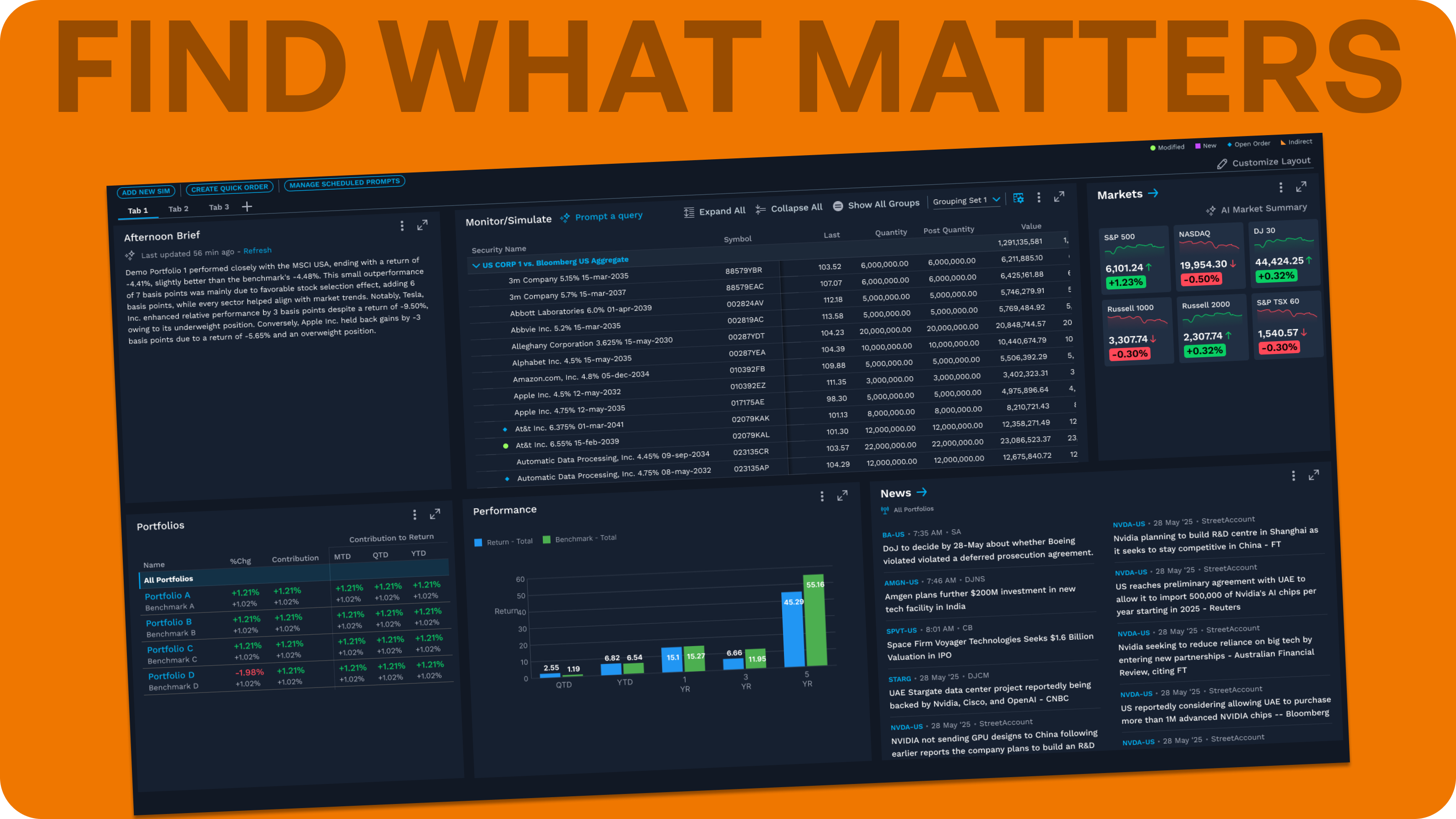
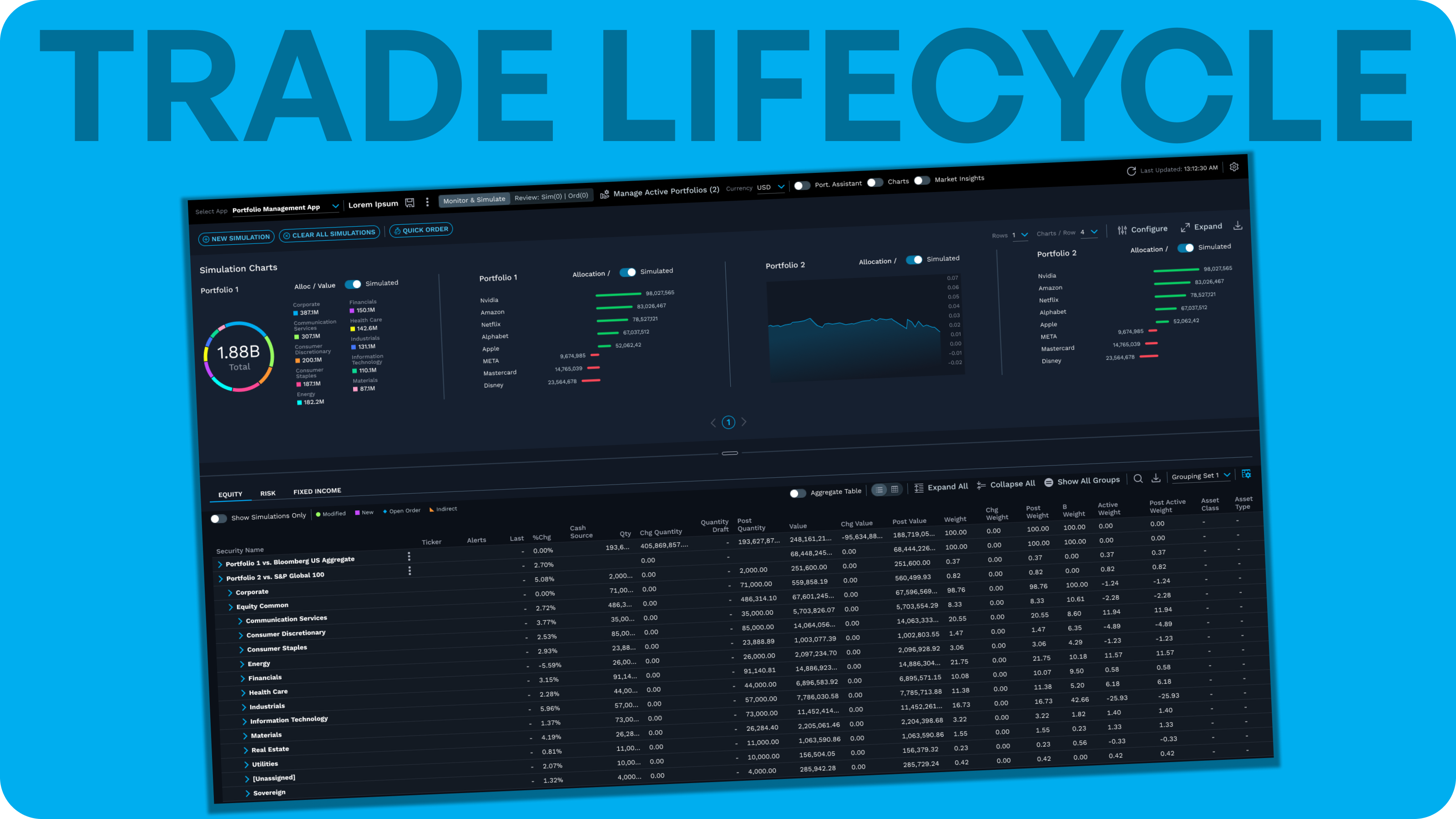
Stage 1 — Portfolio Management: Used by portfolio managers, institutional asset managers, and wealth managers to monitor portfolios in real time and act on market events or internal research by simulating transactions in pursuit of alpha. Users fully customize their data grid and charts to monitor markets and visualize how simulations and live events affect a portfolio. Before a simulated order goes to market, users can run compliance checks and route it through an approval system, where authorized reviewers verify it. Approved orders then pass to a separate order management tool.
Stage 2 — Order Management (OMS): The simulated order becomes a real order. Used by portfolio managers, traders, and middle/back-office staff for role-based workflows — portfolio and order monitoring, pre- and post-trade compliance, post-trade actions, and routing orders to brokers.
Stage 3 — Execution Management (EMS): Used mainly by buy-side traders and portfolio managers for more specialized execution workflows than a typical OMS — sourcing liquidity, finding best price, and executing complex trades.
These applications had existed separately for the entire time I was with the company. Rather than build, maintain, and sell three closely related products, the team set out to unify them into a single offering — the demo was intended to validate the consolidated concept before committing to a full build.
opportunity
Disconnected under the hood. Inconsistent on screen.
The three tools shared no back-end, couldn't hand work off to one another, and sat at three different stages of visual maturity. The opportunity was to give users one connected workflow, on one shared design foundation.
Technically, the applications were built on different back-ends with no shared codebase or structure. A user could build and approve a simulation in the portfolio management tool but had no way to push it forward into order management — each hand-off between stages was a dead end.
Experientially, the trade lifecycle existed as a concept but not as a continuous workflow; users had to carry context across application boundaries themselves.
From a design standpoint, the portfolio management tool used the current design system, the order management system had an entirely separate UI, and the execution management system used only a partial, stopgap implementation of the new design system.
where the real challenge lived
The tools weren't as different as they looked.
Terminology, users, and even the customization model were already shared across all three products. The real design tension was reconciling two different lenses on the same data — portfolio-centric and order-centric — inside one continuous experience.
Several things were already consistent across the three tools:
- Shared terminology. A simulation created in the portfolio management tool remained recognizable as it became a live order that users could monitor across all three tools.
- A single spanning user. The product was designed primarily around a user who "wears all three hats" — someone who moves through the full trade lifecycle themselves, rather than three separate personas handing off between siloed roles. (In larger firms with more specialized staff, admin-assigned, role-based permissions accommodate narrower responsibilities.)
- A shared customization model. All three tools let users start from team-provided column sets and then fully customize the columns in their data grid.
The genuine structural difference was the primary organizing object at each stage:
- The portfolio management tool is organized around portfolios, which can break down through segments like sector and industry down to the individual security level.
- The OMS and EMS are organized around orders, which break down into the individual trades and executions that fill them.
shaping the product
A lean team, working fast, with deep context already in hand.
As the sole designer — and someone who'd already designed two of the three tools individually — I partnered with a Principal Product Manager and his manager to decide which screens would tell the simulation-to-filled-order story, and how to make it feel real.
My scope had two jobs: internally, earning approval and budget to build the product for real; externally, bringing it to lighthouse clients to validate the approach. Because the POC existed to win buy-in and test direction — not ship features — it was optimized for narrative clarity and believability.
I came to this with deep existing context: I was the primary designer for the portfolio management application, and had designed an earlier iteration of the OMS when I first joined the company. My main partner had led the creation of the EMS. Between us, we already held firsthand design context across all three tools — which let the work move quickly without a formal discovery phase.
We combined that knowledge to make two core decisions: which screens would tell the simulation-to-filled-order story end to end, and how to populate them with representative data — plausible, realistic-looking securities, orders, and values we constructed rather than any real client or production data — so viewers could immerse themselves in the product as though it were real. To build that data efficiently and at the scale the demo needed, I used Claude Code to generate it — a technique I'd relied on before on other projects shopped to prospective clients and executive leadership for funding decisions, since believable data at that scale is often what separates a demo that reads as a sketch from one that reads like a real product.
We deliberately kept the effort contained to this core group; as a validation-phase POC meant to secure budget, it was intentionally small and fast, with broader cross-team involvement planned for an actual build.
key decisions
A prototype built from open questions, not finished answers.
The proof of concept followed the trade lifecycle chronologically. Several of its most important screens were new capabilities — not carryovers from the existing tools — each one designed to test a real, unresolved question rather than assert a fixed answer.
order impact panel
Insight, without slowing the order down.
A new panel surfacing four categories of pre-trade insight — sourced from patterns in what users actually referenced, not guessed. Built as an open experiment: is this the right amount of detail, or too much for a "quick" order flow?
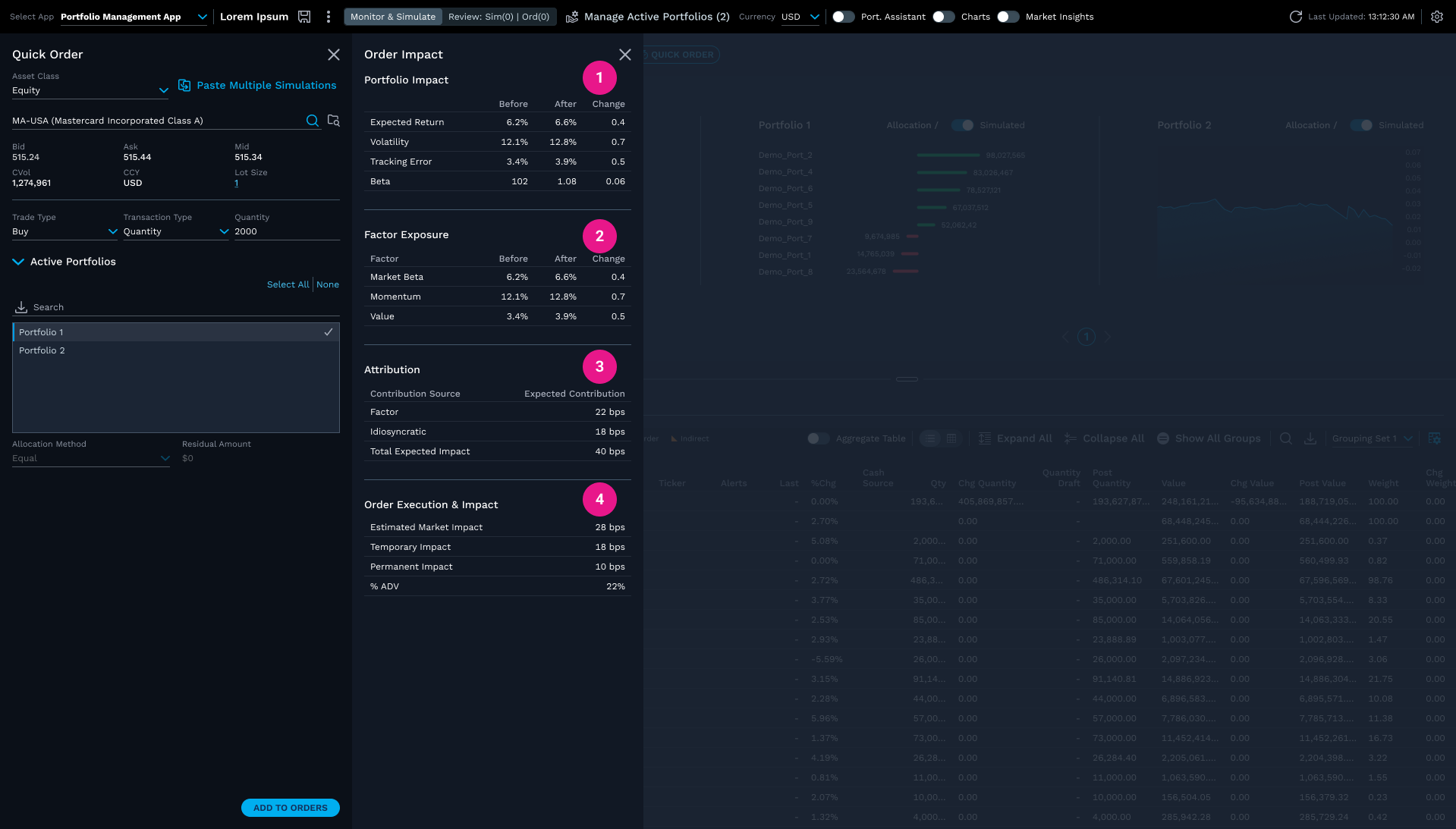
- 1.Portfolio Impact — expected return, volatility, tracking error, beta
- 2.Factor Exposure — market beta, momentum, value
- 3.Attribution — expected contribution by source
- 4.Order Execution & Impact — estimated market impact, temporary/permanent impact, % ADV
- New to the unified product; categories sourced from patterns in what users referenced across order and execution tools
- Open question: is this the right amount of detail, or too much for a "quick" order flow?
Decision
Why
Tradeoff
Evidence
drift alert
Testing two places at once.
Portfolio drift detection, new to the unified product — tested simultaneously in two locations, a status bar alert and a grid badge, to learn where users actually expect to see it.
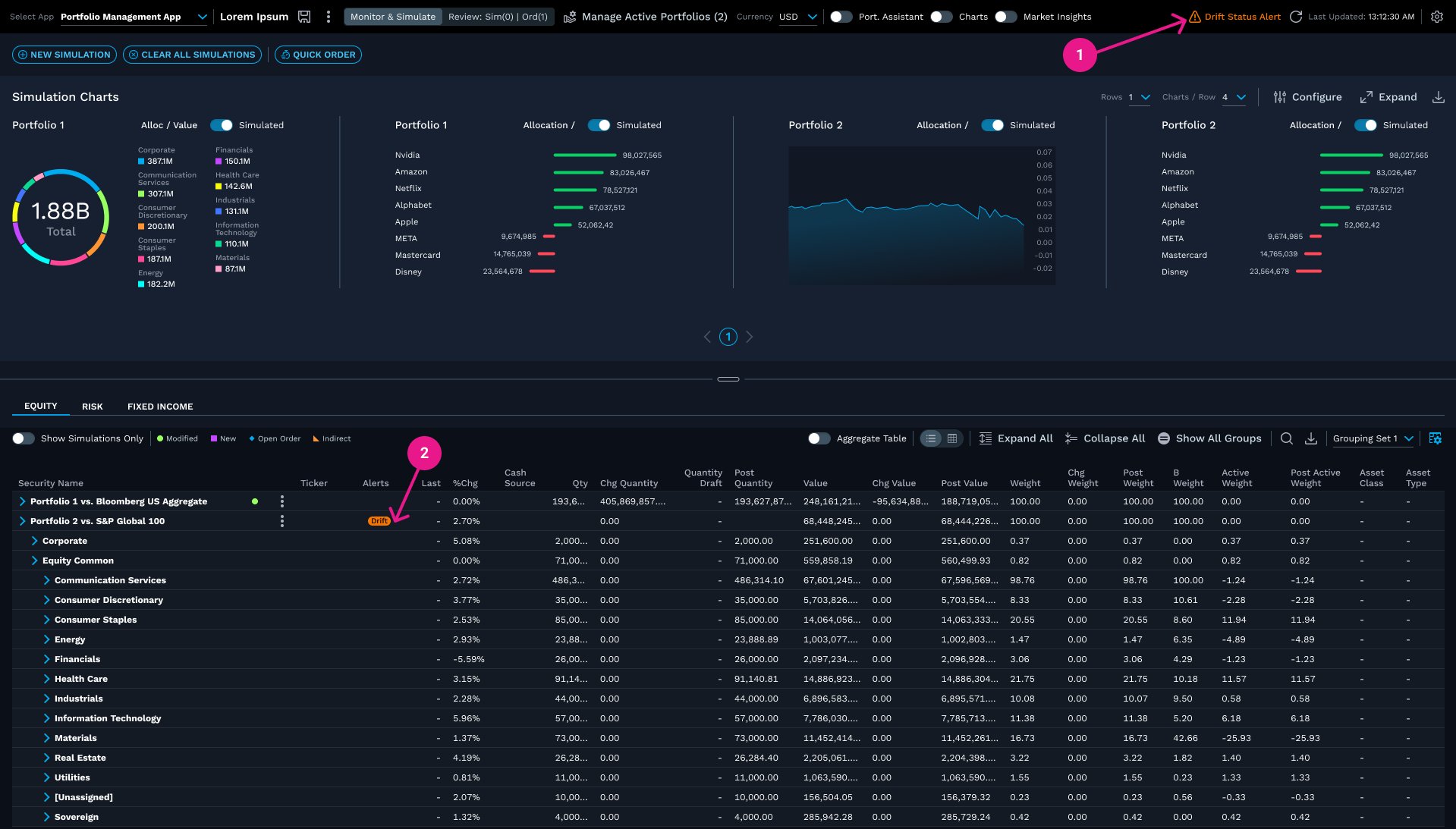
- 1.Status alert in the top bar
- 2.Alert badge in the grid
- Open question: which one (or both) do users expect to click to see the full drift detail?
Decision
Why
Tradeoff
Evidence
drift resolution & review
Multiple paths to resolution, not one prescribed fix.
The drift detail view shows the "why" and offers several resolution paths. On the Review page that follows, Post Active Weight is deliberately emphasized as the number a user would check first.
Decision
Why
Evidence
draft order creation
A necessary middle step.
Accepting a rebalance creates a draft order — an intermediate state between simulation and a live, compliance-checked order, reflecting how regulated trade workflows actually work.
Decision
Why
Note
compliance override & approval routing
A new capability for a regulated workflow.
Users can override a failed compliance rule directly, with approval routed to another authorized user — surfacing, along the way, a real gap: a full version would need an admin workflow for designating approvers.
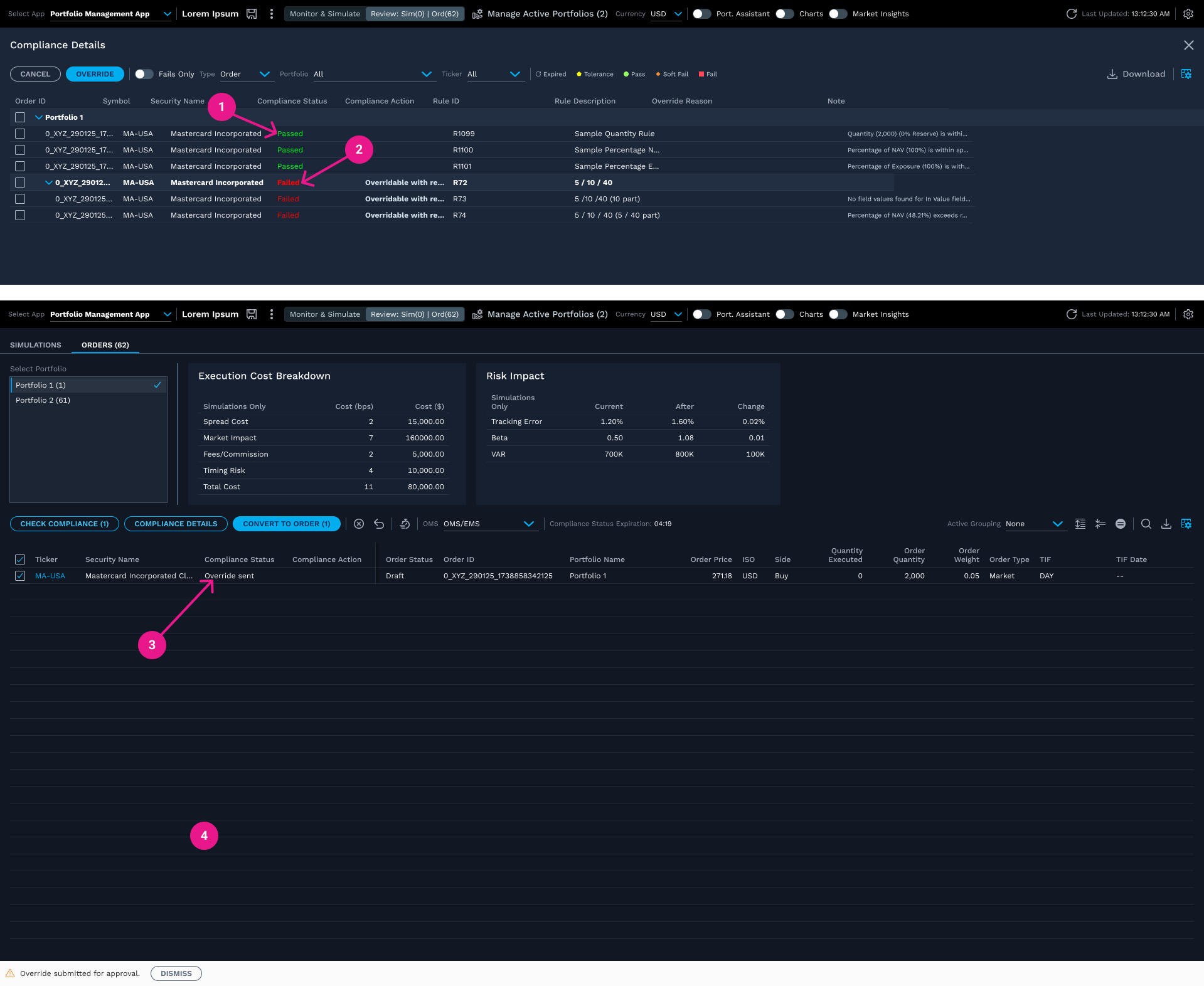
- 1.Rules that pass clear automatically
- 2.A failed rule marked "Overridable" lets a user trigger an override directly
- 3.Once submitted, the order's Compliance Status updates to reflect the pending override
- 4.A toast confirms the request was submitted — not yet approved
- Open gap: a full version would need an admin workflow for firms to designate who holds approver status
Decision
Why
Tradeoff
Evidence
convert to order → submit orders
One button, two states — deliberately left open.
Converting and submitting an order share a single button that relabels once conversion succeeds. I flagged a real usability concern about how subtle that change was; rather than settle it by argument, we left it as a question for lighthouse clients to answer.
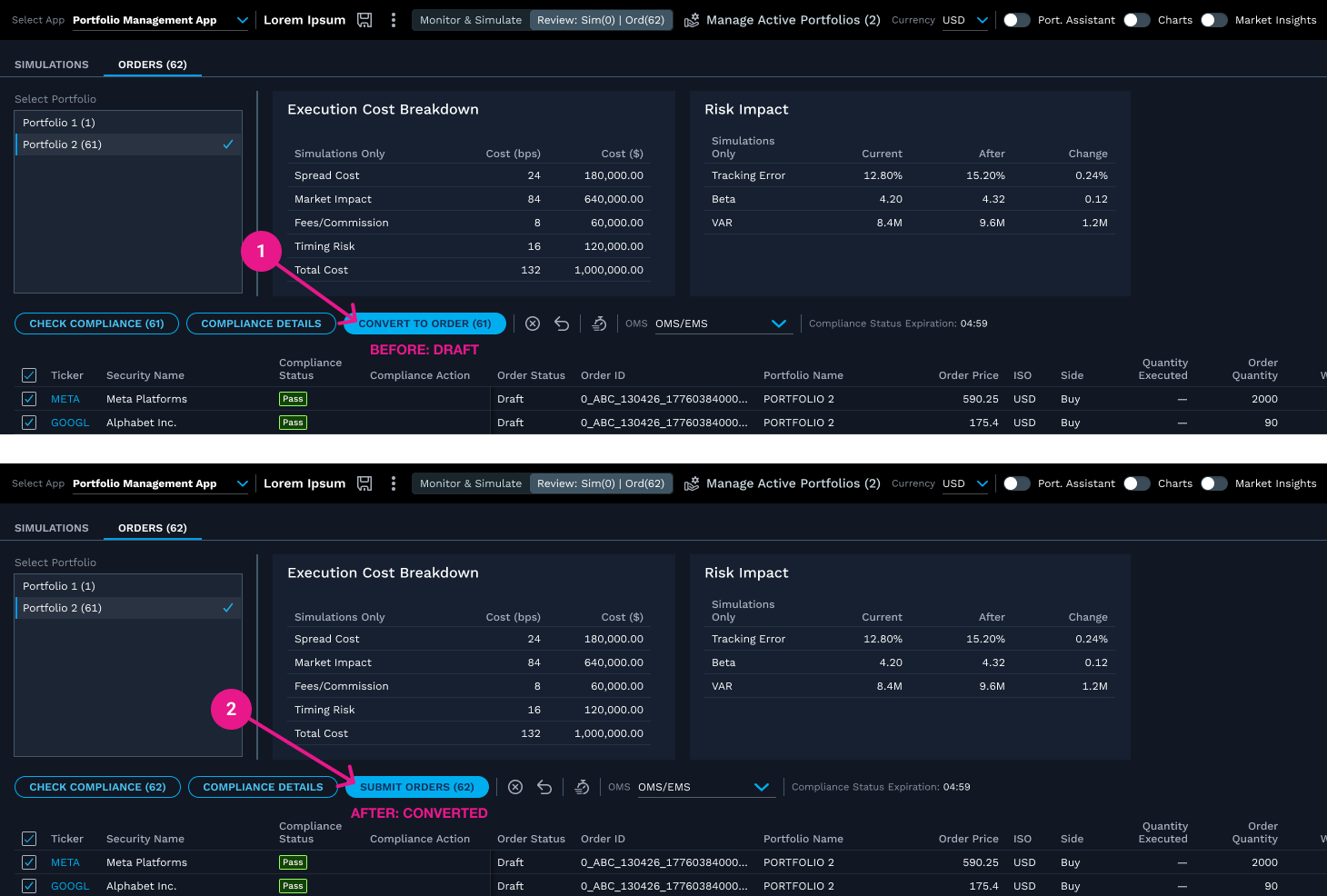
- 1.Before conversion — button reads "Convert to Order"
- 2.After conversion — button relabels to "Submit Orders"
- Open question: is this too subtle for users to notice, or does it need more explicit confirmation?
Try it yourself
Try it. Was that change obvious enough?
Decision
Why
Tradeoff
Evidence
oms/ems execution flow
Completing the story, honestly.
The final stage carried the narrative into existing OMS/EMS wireframes — exploratory work, not new decisions of mine. Switching between tools still relied on the company's existing navigation; true unification of that navigation was a next step I identified but didn't get to build.
Within this environment, a user could review order details, adjust allocation across funds, and route an order to execution via an EMS ticket — completing the trade lifecycle narrative from portfolio-level simulation through to a routed, executing order, though the tools remained joined by workflow continuity rather than a single unified navigation shell.
validation & feedback
Feedback from the people closest to the work.
The project ended before reaching lighthouse clients. What I can speak to is internal: consistent review with my closest collaborator and his manager, real scope conversations as new features were added, and several design questions intentionally left open for the validation the project didn't reach.
The Principal Product Manager reviewed the demo as it developed; it was also shown to his manager, the senior director, and was well received. Broader reviews — with leadership more widely, other teams, or the lighthouse clients themselves — were the planned next step that the project didn't reach.
Even without formal testing, the iterative build surfaced real tensions around scope. New capabilities kept getting added — most notably the Drift Alert, which wasn't part of the original concept, along with the Execution Cost Breakdown and Risk Impact tiles on the Review page. This eventually prompted a deliberate conversation about how many new features the POC actually needed versus how many would dilute its core story. That kind of scope discipline — recognizing when a validation-stage demo has accumulated more than it needs — is itself a design decision, separate from the individual screens.
outcome
A complete, coherent proof of concept — and an honest stopping point.
I can't speak to whether this secured budget or client validation; my involvement ended before that stage. What I can state directly: a full, working prototype was built end-to-end, and it was well received by senior stakeholders.
The POC was designed to demonstrate the value of a unified trading platform and gather lighthouse client feedback in support of an internal budget request — the validation stage where the project's actual business outcome would have been determined, and something outside what I can speak to.
The more honest framing of this project's outcome is not a business result, but a demonstration of capability: translating an ambiguous, high-stakes business goal — combine three products into one, prove the value, secure funding — into a working, testable interactive prototype, largely solo, while navigating real design disagreements with stakeholders productively rather than either capitulating or stalling progress.
reflection
Trust, built over years — and tested under pressure.
This project worked because of a high-trust partnership built over years, not assumed on day one. In the final week, I rebuilt the demo's fuller narrative under real time pressure — without missing a single check-in with the five people who reported to me.
That history is part of why we could disagree productively — as with the Convert to Order/Submit Orders decision — without it becoming friction.
Some of what could be labeled feature creep — particularly the time spent refining the grid and related wireframes — wasn't a detour from the story; it was part of telling it well. Recognizing when added scope genuinely strengthens a narrative, versus when it dilutes it, was itself part of the judgment this project called for.
Designing solo wasn't new to me — it was how I typically worked on the portfolio management application, and I was often the designer the UX strategist for buy-side applications called on when senior leadership needed a demo built.
The demo originally centered on a single, narrower story — a Mastercard quick order — without the Order Impact panel. In that final week, I updated fifteen screens to build out the fuller trade lifecycle narrative and bring the OMS/EMS wireframes into visual and behavioral consistency with those changes. That combination — delivering focused, high-quality design work under real time pressure while still showing up fully for a team that depended on me — is something I'd want a reader to take from this project as much as any individual screen decision.