Prospect to Proposal
Giving wealth advisors a fast, credible way to turn a prospect's holdings into a compelling proposal — without the manual detour through Excel.
- role
- Design lead (VP, Associate Director, UX Design) — drove decisions, stakeholder alignment, and split execution with a direct report.
- timeline
- October 2024 - November 2025
- team
- Design lead (VP, Associate Director, UX Design) + 1 senior designer (direct report), 1 PM, senior engineering lead + dev team
- platform
- Web (institutional wealth management platform)
Company and product details are generalized due to a confidentiality agreement. Happy to speak to specifics in conversation.
context
A prospect's portfolio isn't worth the usual setup — until they say yes.
Wealth managers need to sell as much as they need to advise. After an initial client meeting, they're expected to analyze a prospect's holdings and come back with a compelling case — but the company's platform had no tool built for that moment, so advisors built the case themselves, by hand, in Excel.
Existing clients already have their portfolios loaded into the platform — typically through white-glove onboarding, though advisors can also do it themselves — and that data becomes usable across any of the platform's other applications. That process doesn't serve prospects well: uploading a portfolio properly is cumbersome enough that doing it for someone who hasn't committed to becoming a client isn't worth the effort, especially if they say no.
So advisors filled the gap themselves — bouncing between spreadsheets and whatever other platform applications they needed to reference, during exactly the window when they most needed to move quickly and look credible.
The application was meant to close that gap: giving advisors a way to quickly upload a prospect's holdings, run analysis, and surface recommendations that could help the prospect see a better return — cutting out the manual work and the app-hopping in between.
opportunity
Every workflow on the platform assumes a portfolio already exists. Prospects break that assumption completely.
This wasn't a missing feature so much as a missing category — the platform's analytical depth, and the company's own biggest selling point, had no on-ramp for a client who didn't exist yet.
Every dashboard, every analysis, every downstream workflow on the platform depends on portfolio data already being in the system — a prospect falls entirely outside what the platform is built to handle, which meant the fix needed something closer to a new front door than a small addition to an existing tool.
That mattered beyond convenience. Deep data coverage is one of the company's central selling points, which meant the moment with the highest stakes for a wealth manager — proving they can deliver more value than a prospect could get elsewhere — was the exact moment the company's own core differentiator wasn't actually available to them. The opportunity wasn't just to save advisors time; it was to close the gap between what the company was known for and where that reputation actually showed up.
where the real challenge lived
The platform's core strength — depth — was exactly what a prospect-facing tool couldn't afford to lead with.
The tension wasn't technical difficulty; it was a genuine values conflict. The platform's differentiator is thoroughness. But a prospect might say no, so the tool built for them had to prioritize speed. That conflict showed up concretely in two open questions: what to do with holdings the platform couldn't fully recognize, and how much analytical depth advisors actually wanted before a decision got made for them.
That tension surfaced in two concrete places.
First, coverage gaps: the securities most likely to trip up analysis weren't obscure edge cases. Private equity, hedge funds, and energy infrastructure vehicles are common holdings for exactly the kind of prospect a wealth manager is courting, and they don't have the standardized market data the platform's analysis depends on. Blocking the flow on an unrecognized holding would have undermined the tool's entire premise of a fast first pass — so the design had to find a way to approximate rather than halt.
Second, an open question the team never fully resolved: with a data platform this broad behind the tool, "more" was almost always technically possible. The harder question was what advisors actually needed at the moment of a sales pitch, versus what simply could be shown because the data existed.
shaping the product
A senior team, a first-time product owner, and real friction over what "helpful" actually means.
I led design with one direct report — a senior designer — reporting to me, partnering with a product manager who was newer to building and shipping software, and a senior engineering lead running a team of developers. The effort was sponsored by a group of product managers in the company's wealth product group, and ran for roughly over a year. Real friction surfaced early: feature creep, requirements drawn more from conversations with the sales team than from direct user research, and stakeholder pushback that sometimes favored personal preference over usability.
Some of what made this project genuinely difficult wasn't the interface — it was the conditions around it. That inexperience led to real assumptions about what kind of data users would find helpful, some of which held up and some of which didn't. Because the platform's data depth is one of its core selling points, scope discipline was a constant, active argument rather than a settled principle — narrowing what the tool showed was something I had to keep making the case for, not something the team agreed on from the outset.
Requirements didn't always arrive settled, so my direct report and I ran regular working sessions using rapid Figma prototypes to think through vague or partially-formed requirements before bringing anything to the PM and engineering lead — using the prototype itself as the way to pressure-test what the workflow actually needed to account for. Sometimes that process surfaced places where the two of us had quietly drifted out of alignment with each other, and prototyping together was what pulled us back onto the same page before a review.
The proxy security workflow is where this mattered most for the whole team, not just the two of us. The deeper we got into designing it, the more open questions surfaced — what should happen to a security's weight once it's excluded, how much of that should be automatic versus left to the advisor, what a user needed to see to trust an analysis that wasn't fully resolved. When we brought a working Figma Make prototype to the PM and engineering lead, they realized the workflow involved considerably more moving parts than they'd originally scoped it to be. From there, the prototype went in front of other stakeholders, who were able to clarify what the workflow actually needed to account for — turning something that had arrived as a single line item into a shared, specific understanding across the whole team.
None of this was adversarial in a way that stalled the project — it was closer to a team still building its own product muscle, and part of my job was pushing back constructively where it mattered (a broken workflow, an accessibility issue, a case for validating an assumption with users) while picking my battles elsewhere.
key decisions
Five decisions, from a flow built to move fast — not to answer every question upfront.
The product followed the prospect's journey chronologically: upload holdings, resolve what the platform couldn't recognize, compare against a model, decide what to build later, and hand the advisor something to bring back to the room. Several of the most consequential choices weren't about a single screen's layout — they were about scope: what to build, what to reuse, and what to leave for a future version.
portfolio upload
A spreadsheet-like entry point, built on a component that couldn't fully deliver on that promise.
Users upload a prospect's holdings manually, choosing between weight-based or share-based entry. But the internally built grid behind that entry carried real limitations — against an audience that expected something closer to Excel.
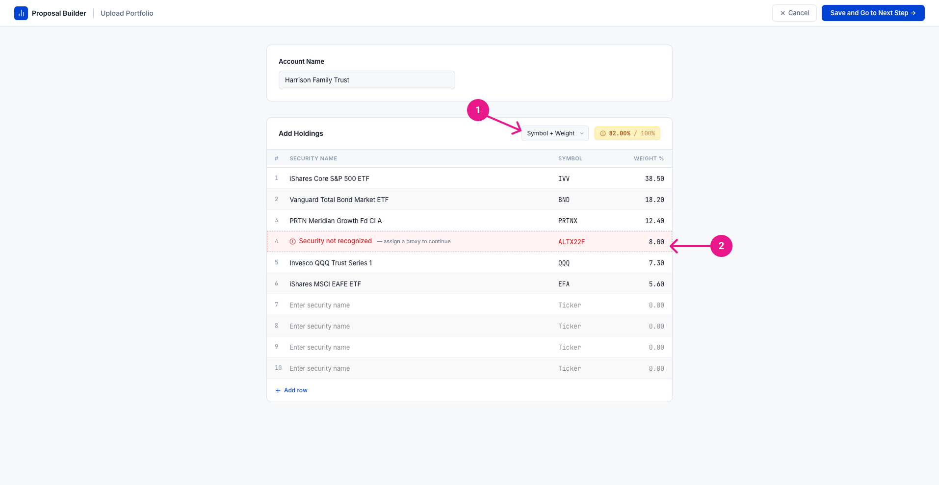
Built for speed, not polish.
- 1.Allocation Type toggle lets advisors enter holdings by weight or share count, depending on what they have on hand — often a statement or notes from the client meeting, not a formal export.
- 2.Unrecognized securities are flagged inline but don't block the flow; resolving them is required before moving forward, handled in a separate step.
Decision
Why
Tradeoff
Evidence
proxy security assignment
Not every holding a prospect owns has standard market data behind it.
Alternative assets — private equity, hedge funds, energy infrastructure vehicles — surfaced as "not recognized" during upload, and resolving them was required before the user could move forward. That same resolution panel stays reachable afterward, from the Active Portfolios list, so advisors can revisit a proxy choice later without redoing the upload.
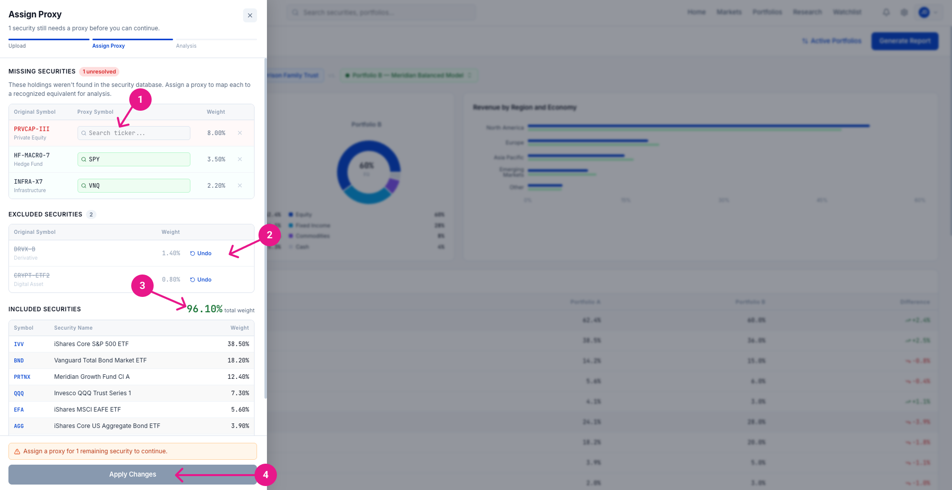
Approximate, don't block the pitch.
- 1.Missing Securities — mostly private equity, hedge, and infrastructure funds — can be matched to a comparable proxy for analysis.
- 2.Excluding a holding instead doesn't auto-redistribute its weight; the advisor is responsible for manually redistributing it.
- 3.The Included total shows how much of the portfolio the analysis actually reflects.
- 4.Nothing takes effect until Apply Changes is clicked.
Decision
Why
Tradeoff
Evidence
model comparison, swappable on demand
A scope fight resolved by asking what the comparison was actually for.
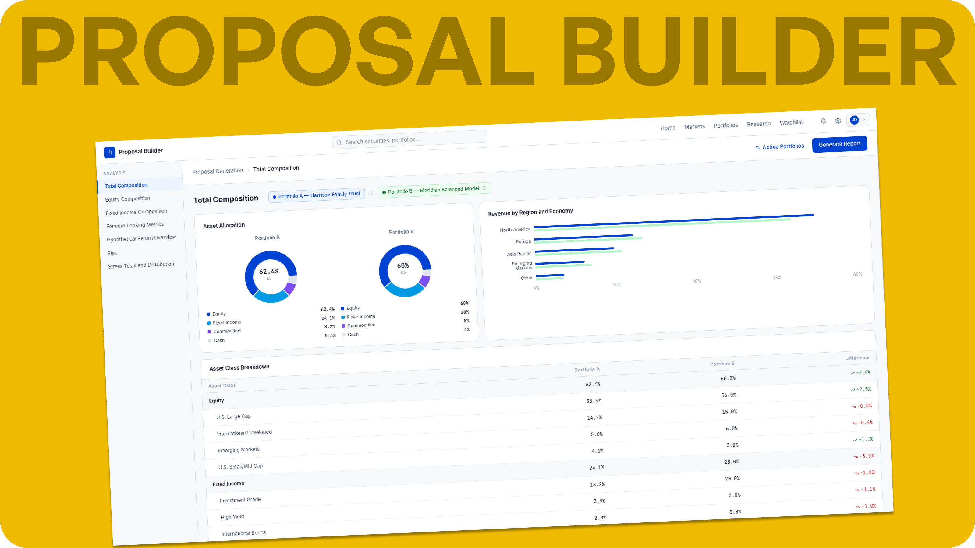
An early stakeholder ask — compare a prospect's portfolio against up to five models simultaneously — would have restructured much of what was already built for the app. The resolution: advisors can load up to five of the firm's models alongside the prospect's portfolio, but the comparison view always shows exactly two at a time, with a dropdown on the Portfolio B label letting them swap which model is currently being compared.
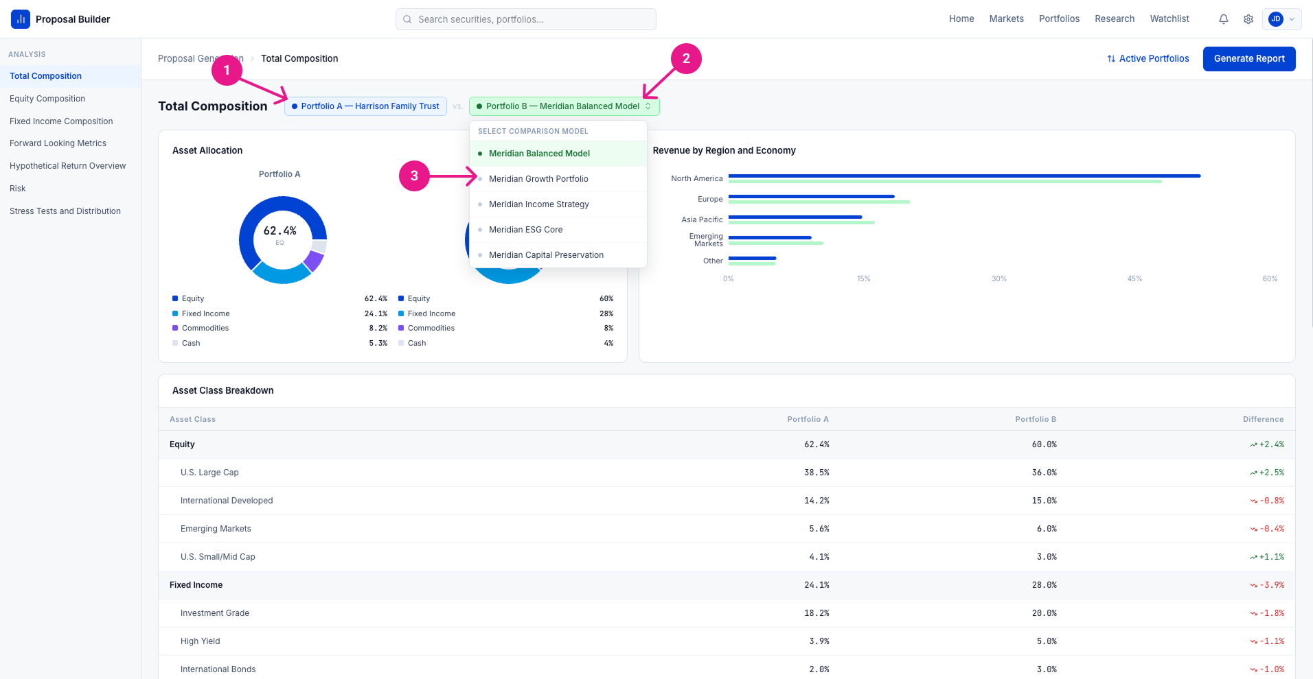
One swap, not five columns.
- 1.Portfolio A is fixed — the prospect's original holdings, never swappable.
- 2.The Portfolio B label opens a dropdown to swap the comparison.
- 3.The dropdown lists up to five firm models plus any duplicated, edited version of the prospect's own portfolio — selecting one updates the whole comparison instantly.
- Resolved this way after stakeholders asked for a five-way simultaneous comparison — advisors can load five candidates, but still only see one against the prospect at a time.
Decision
Why
Tradeoff
Evidence
duplicate, then customize — never edit the original
One pattern, applied to any portfolio in the system.
Rather than build a from-scratch construction tool, advisors can duplicate any portfolio — a model, or the prospect's own current holdings — and edit the copy. Applied to a prospect's own portfolio, this became a genuine sales device: an advisor can show a hypothetical, better-managed version of a prospect's existing money next to what it actually looks like today.
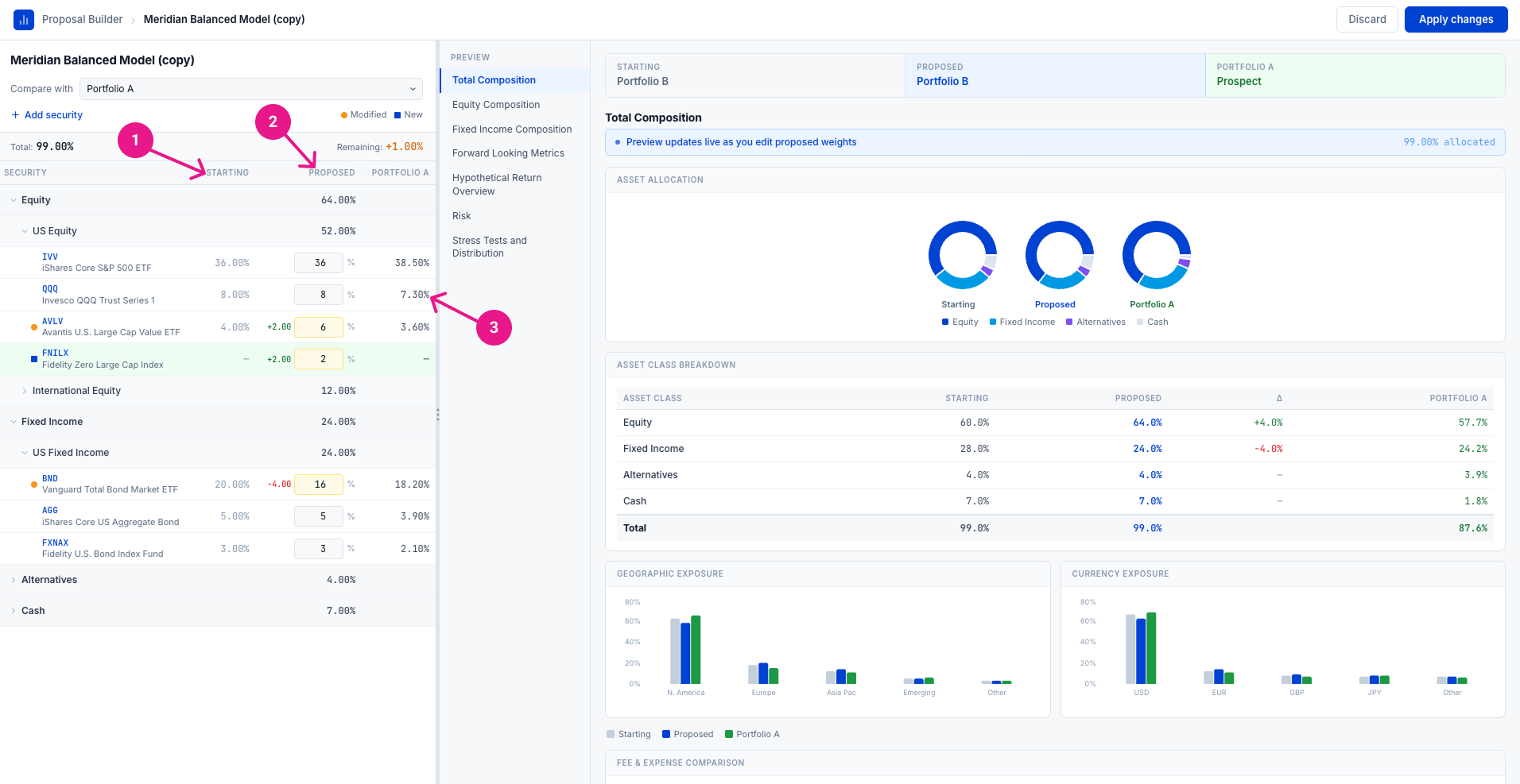
Duplicate first. Never touch the original.
- 1.Starting holds the original values of whatever was duplicated, untouched.
- 2.Proposed is where an advisor reweights or adds securities.
- 3.The reference column shows the prospect's actual current holdings throughout.
- Duplicating and editing the prospect's own portfolio — not just a model — turned this into a sales device: showing a hypothetical, better-managed version of a prospect's existing money.
Decision
Why
Tradeoff
Evidence
connecting to the portfolio management hub
Choosing not to build a competing product.
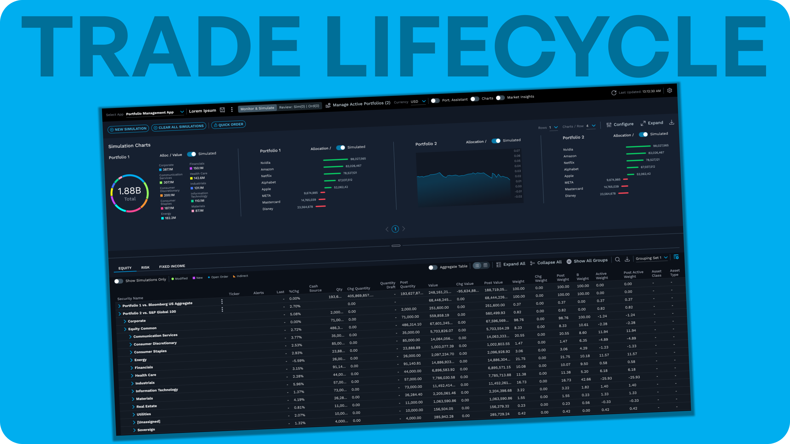
Early plans called for a standalone portfolio analysis engine built just for this app. I pushed to connect to the company's existing portfolio management application instead — the same tool at the center of the unified trade lifecycle project — rather than let the team build something that risked cannibalizing it.
Decision
Why
Tradeoff
Evidence
validation & feedback
This one reached real users — further than the trade lifecycle project got.
Unlike the earlier proof of concept, this shipped: released internally, then out to lighthouse clients, where it entered an active feedback stage. That feedback wasn't fully processed before my visibility into the project ended.
Feedback that came back before I left centered largely on requests for additional features, which the team made a deliberate call to defer to future iterations rather than build immediately — a sign of the same scope discipline that had been a point of friction earlier in the project, now working in the product's favor.
What happened after I left — whether it led to a broader rollout, further iteration, or measurable impact on how advisors close prospects — isn't something I have visibility into.
outcome
A complete product, live with real prospects and real advisors — with the final chapter outside my view.
I can state directly that a full, working product shipped, reached lighthouse clients, and entered active feedback. What I can't speak to is what came after: whether that feedback led to broader adoption or measurable impact on how advisors close new business.
What I can state directly is that a complete product shipped end-to-end — upload, proxy resolution, model comparison and customization, and report generation — and reached real lighthouse clients, further than the trade lifecycle proof of concept managed to get before my involvement in that project ended.
The more honest framing of this project's outcome isn't a business result — adoption, revenue impact, or advisor satisfaction are outside what I have visibility into — but a demonstration of what it took to get there: turning a genuinely difficult set of working conditions (an inexperienced product owner, real feature creep, requirements shaped more by sales conversations than user research, stakeholder pushback rooted in personal bias, and a genuinely hard data-coverage problem in the platform's alternative-asset gap) into a coherent, shipped product, while also growing a direct report's own judgment along the way.
reflection
The same instinct, twice — and a chance to teach it directly.
Pushing to connect this project to the company's existing portfolio management application, instead of letting a newer product manager's team build a competing one, was the same integration-over-duplication judgment that shaped the trade lifecycle project. Here, I got to apply it earlier, and pass it on.
The same instinct showed up on a smaller scale in the proposal tool's report builder: reusing an existing report-generator pattern surfaced a data-lifecycle mismatch between prospects and onboarded clients, and I flagged that gap the same way, directly and early, rather than waiting for it to become someone else's problem.
That same dynamic — using the work itself to teach, not just to ship — ran through how I managed my direct report over the year. She had been having a hard time resolving her own disagreements with a product manager, so I used this project as a chance to show her directly how I navigate that: when to push back hard (a workflow-breaking issue, an accessibility gap, a pattern chosen from bias rather than evidence) versus when to let a genuine open question ride into user feedback instead of forcing a resolution I wasn't sure of myself. The model-comparison decision is a good example of the latter — swapping one candidate model at a time gets advisors most of what a true side-by-side view would, but not all of it, and rather than push further to force a "complete" answer, I let that gap stand as a real question for lighthouse clients to weigh in on.
Working within the platform's own limitations — an internally built grid that couldn't deliver the Excel-like experience users expected — was a similar kind of discipline: designing honestly around a real constraint rather than either pretending it away or refusing to ship until it was fixed.
If there's one thing I'd want a reader to take from this project, it's that judgment showed up on two levels at once: technical and structural calls, like scoping the model-edit workflow down to something buildable, or integrating with an existing system instead of duplicating it, alongside the less visible work of navigating an inexperienced stakeholder group and deliberately growing someone else's ability to do the same.