Find What Matters
Rethinking the entry point to a portfolio management application — where a triage problem, not a technical one, drove three sequential pivots.
- role
- Principal Designer
- timeline
- March – May 2026
- team
- Principal Designer (sole) + Senior Product Manager, Senior Engineering Lead, Associate Director of Engineering
- platform
- Web (institutional portfolio management platform)
Company and product details are generalized due to a confidentiality agreement. Happy to speak to specifics in conversation.
context
The portfolio management application had no dedicated starting point or landing page — the grid was the application. Research surfaced a real triage problem underneath that flexibility, and a separate stakeholder group set out to explore what a starting point could look like.
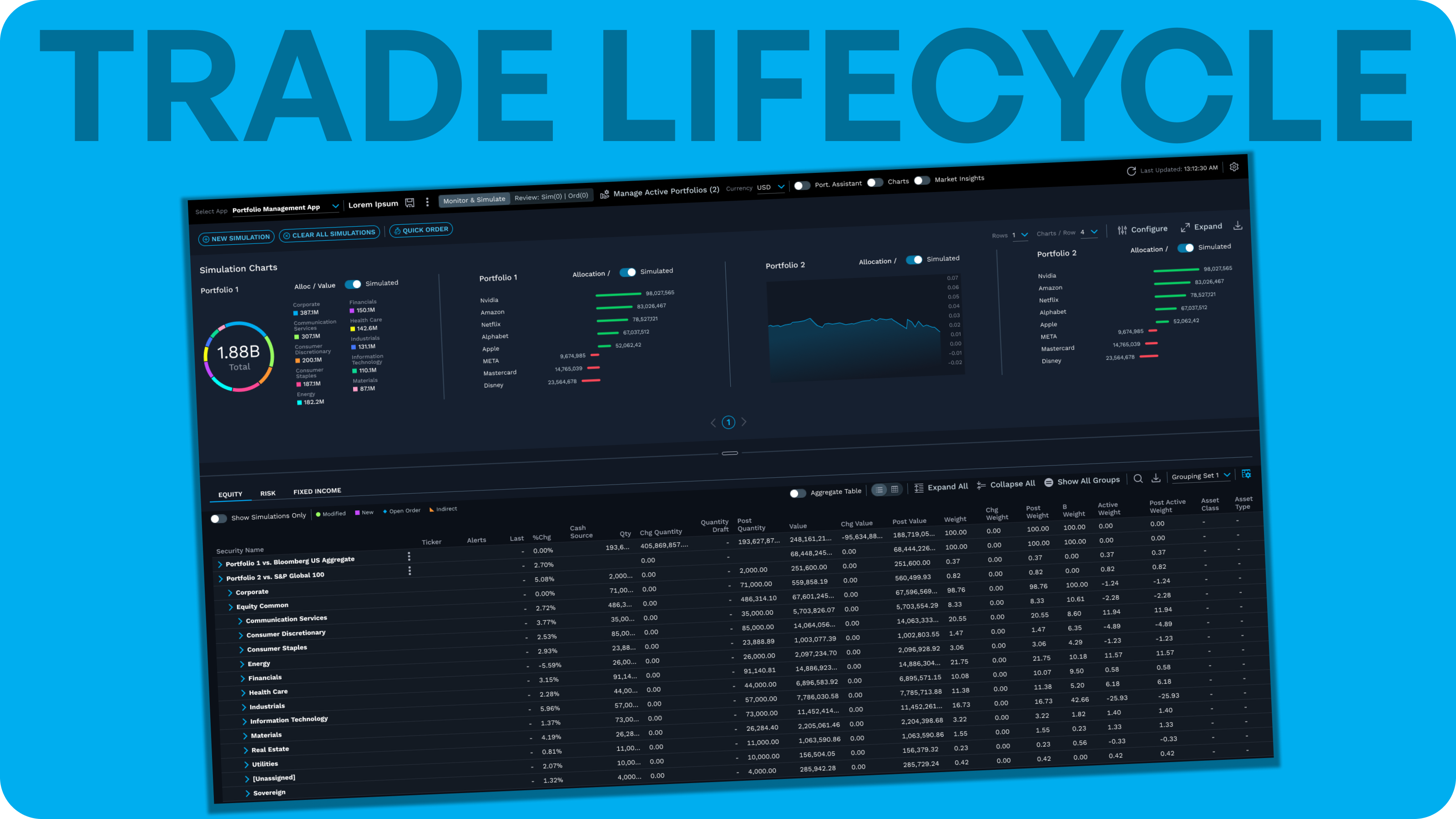
The application's core surface was a highly configurable grid, where users monitored the portfolios and securities they'd loaded, with full control over column selection and groupings (e.g. by sector). Users could also enable expandable/collapsible charts, positioned either in a side panel or a horizontal panel above the grid. Core workflows centered on monitoring holdings and running simulations against market events and conditions.
Our UX researcher conducted a round of interviews focused on general product sentiment — what was working, what was missing, what could be improved. I participated in a subset of these sessions. One of the key findings was that while the application was powerful once mastered, it could feel overwhelming, particularly around filtering the grid down to what needed attention. Users described anxiety about missing important information simply because it wasn't currently in view, and no mechanism existed to alert them when something changed on a portfolio they were tracking.
This research took place before my trade lifecycle POC work began, though the two efforts overlapped toward the end of this project's timeline. The dashboard redesign concept explored here was taken on by a different set of stakeholders — a Senior Product Manager, a Senior Engineering Lead, and an Associate Director of Engineering.
problem statement
The grid's flexibility came at a cost: nothing distinguished "requires attention" from "everything else," and there was no way to be notified when something changed. Users were effectively asked to provide their own vigilance layer, manually, in a domain where missing a change carries real financial consequence.
The application's grid-first design gave power users full control, but that same flexibility created a triage problem: nothing in the interface distinguished "requires attention" from "everything else." Users had to manually scan a fully configurable grid to catch what mattered, and research surfaced real anxiety around this — specifically, the fear of missing something simply because it had scrolled out of view. Compounding this, there was no alerting mechanism: if a portfolio a user was actively tracking changed in a meaningful way, they had no way to be notified. They could only find out by looking.
This gap had been present for a while, but a few forces converged to move it from a known pain point to an active stakeholder priority: the team was already working through smaller usability fixes, there was broader internal momentum toward a more dashboard-oriented approach across the platform, and a potential shift in how the platform would present itself to users more generally. Competitive pressure also played a role — as competitors began encroaching on the company's position in the market, the pain point research had surfaced took on more urgency.
constraints & complexity
We started with an ambitious dashboard concept and hit a real roadmap constraint, not a technical one. What followed was a sequence of scoped-down pivots — each one surfacing a new problem that shaped the next decision.
The primary constraint was scope, not feasibility: a full dashboard-style starting point would have amounted to a complete redesign of the application, and that wasn't within the product group's roadmap. The team's mandate was to deliver value to existing users and attract new ones — goals a full redesign didn't clearly serve within the timeline the group was working against. This created real tension early on: the product manager and I saw an opportunity to better surface issues, potential problems, and other information users would find valuable, and initially pushed for a fully configurable dashboard of content blocks. Engineering held firmly to the position that the grid was the application, and the scope of a full redesign wasn't something the roadmap could absorb.
Rather than abandon the idea, we scaled it back toward the grid itself. The product manager's research surfaced a telling workaround: a noticeable number of users had already built their own manual solution by creating multiple grids — sometimes several views into the same group of portfolios, sometimes one grid per portfolio. This became the seed of a smaller-scoped concept: a tile-based layout allowing users to arrange up to four grids at once. The tile pattern itself was adapted from a broader company design system initiative that had already been tested with users, rather than designed and validated from scratch for this project.
This concept introduced a new complication, though: surfacing multiple grids simultaneously meant less of any single grid was visible at once, which compounded the original filtering problem rather than resolving it.
Around the same time, there was organizational momentum to find opportunities for AI and agentic capabilities across the product line. This intersected with the filtering problem in a useful way: rather than solving triage through layout alone, we explored a natural-language query capability scoped to the grid a user was actively viewing — allowing something like "show me VWAP" or "show me my largest positions, overweight vs. benchmark, that have changed the most recently." The PM compiled this initial set of candidate phrasings and validated them with subject matter experts and sales, reflecting language we believed users would realistically reach for — and the concept proved technically buildable.
This became the actual path forward, scoped to an MVP and built into the current single-grid interface. It was released internally, as a smaller pilot, during my time on the project. The tile/multi-grid concept was positioned as the next phase, with the original full-dashboard vision remaining a longer-term direction beyond that.
role & process
I owned all design work; the PM owned scope and research; engineering owned feasibility. The process was collaborative at every stage rather than a linear handoff, which is why the pivot sequence above was able to move as quickly as it did.
I owned all design work on this initiative — mapping the end-to-end workflow, laying out the screens, and designing each concept as it evolved through the three phases described above. The Senior PM owned scope: defining and refining what the effort should cover, and grounding decisions in Pendo data, prior user research, and past usability testing. The engineering side — a Senior Engineering Lead and an Associate Director of Engineering — was responsible for build feasibility and for surfacing gaps the design hadn't accounted for.
The PM wanted input from all three functions at every stage. The pivot sequence in Constraints & Complexity reflects that back-and-forth directly — the dashboard concept was scaled back after engineering input, the tile concept emerged from the PM's research, and the AI-assisted filter direction came out of a broader organizational push that all four of us were reacting to together.
The tile-based layout itself came into this project through me directly: three of my direct reports were actively working on the design system initiative that pattern originated from, which gave me early visibility into a proven, already-tested solution I could bring into this problem rather than design from scratch.
For the multi-grid and AI-assisted filter concepts specifically, I used Figma Make early on to think through the overall workflow, then moved into Claude Code once we needed to prototype using our actual design system components. Building live, in real components rather than static mockups, made limitations and tradeoffs concrete in the room rather than theoretical — the team could see exactly what a direction would look like and cost to build, not just hear it described.
This work ran from March 2026 through the end of May 2026, overlapping with the tail end of my trade lifecycle POC work.
key decisions
Four decisions, in sequence: scale the dashboard concept back to the grid, commit to a tile-based layout as the next iteration, settle on how the AI-assisted filter should actually work, then decouple and ship it ahead of the multi-grid build.
scaling the dashboard concept back to the grid
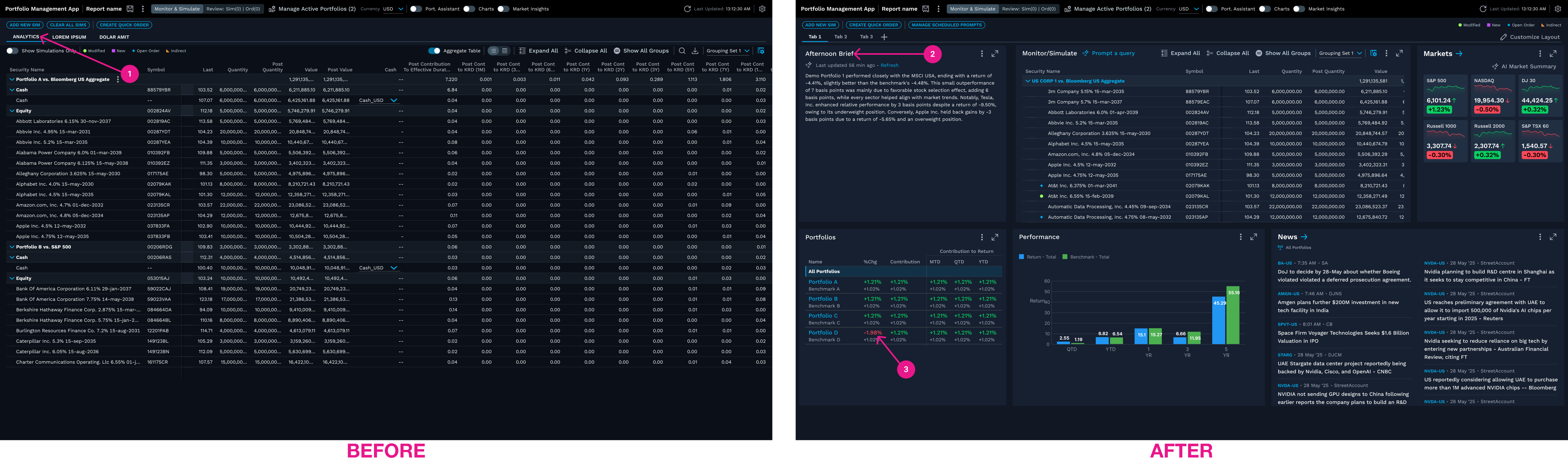
- 1.Before: there was no starting point. The grid was the entire application from the moment users logged in.
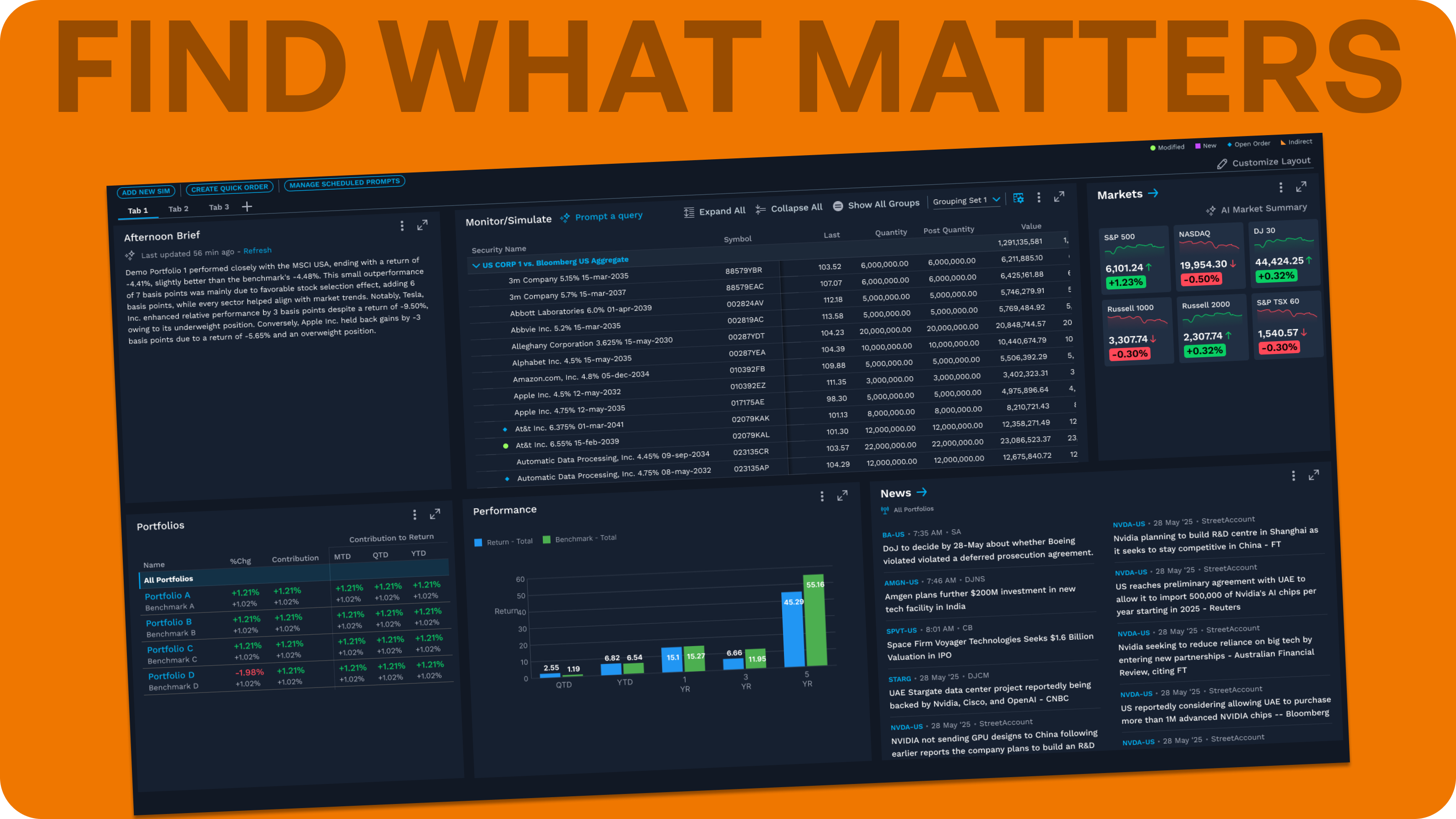
- 2.Concept: a narrative summary block, surfacing performance context without requiring the user to build a query.
- 3.Concept: one portfolio flagged in red — an early, illustrative gesture toward the triage and alerting users had asked for.
Decision
Why
Tradeoff
committing to a tile-based multi-grid concept
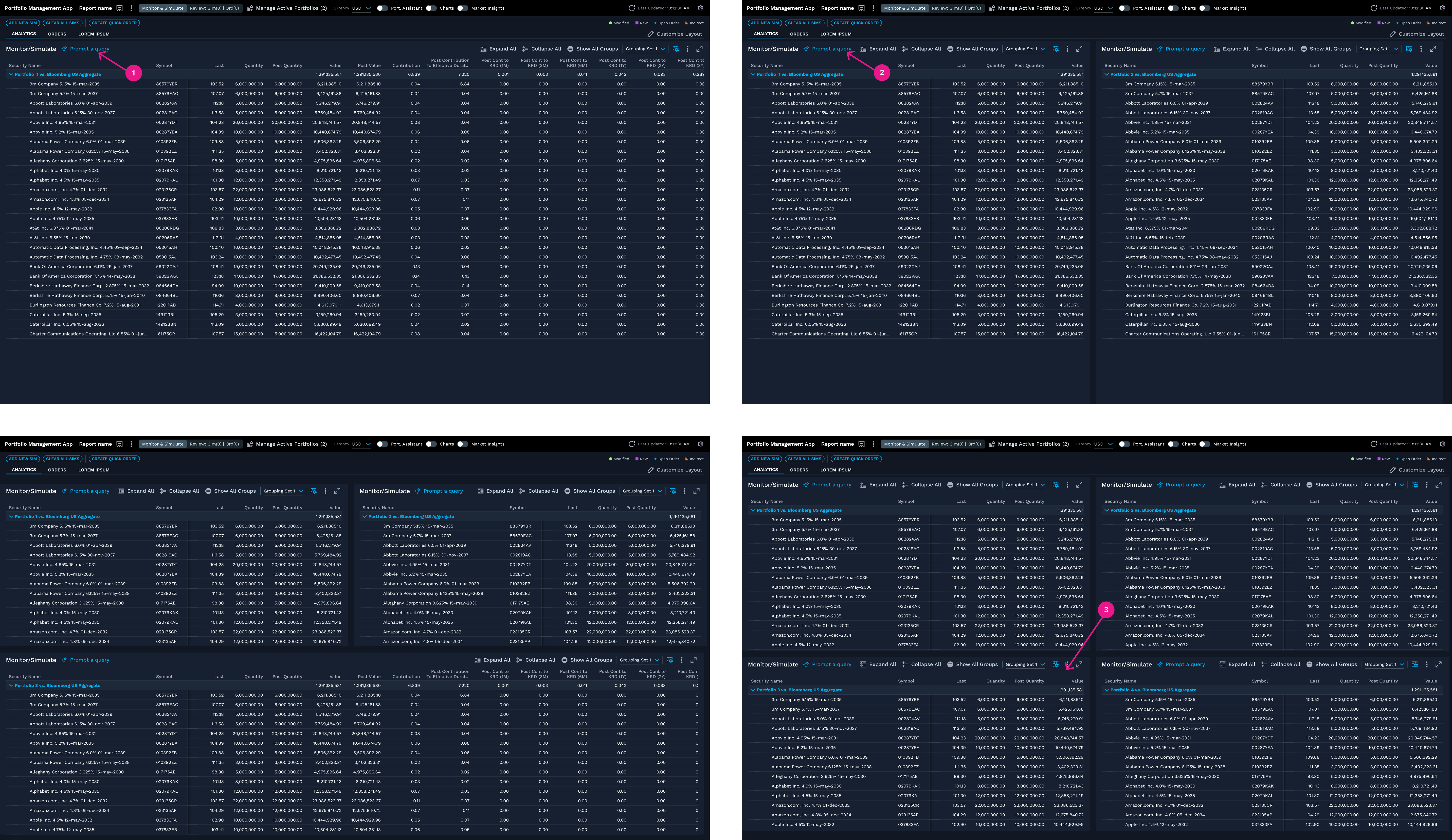
- 1.Today's single-grid interface — the unchanged baseline every layout option was arranged around.
- 2.Each tile carried its own "Prompt a query" entry point — consistent across every layout explored, and the earliest visual form of what became the AI-assisted filter.
- 3.Four tiles was the practical cap for a first pass. Beyond this, less of any single grid stayed visible — compounding, not solving, the original filtering problem.
Decision
Why
Tradeoff
choosing the query's interaction pattern
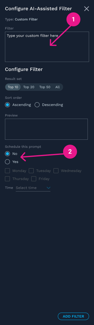
- 1.A free-text box let users type a custom query directly.
- 2.Scheduling a saved prompt to rerun automatically was explored here, but cut from the MVP — a candidate for a future phase if usage data showed people running the same queries repeatedly.
Decision
Why
Tradeoff
decoupling natural-language filtering from the multi-grid roadmap
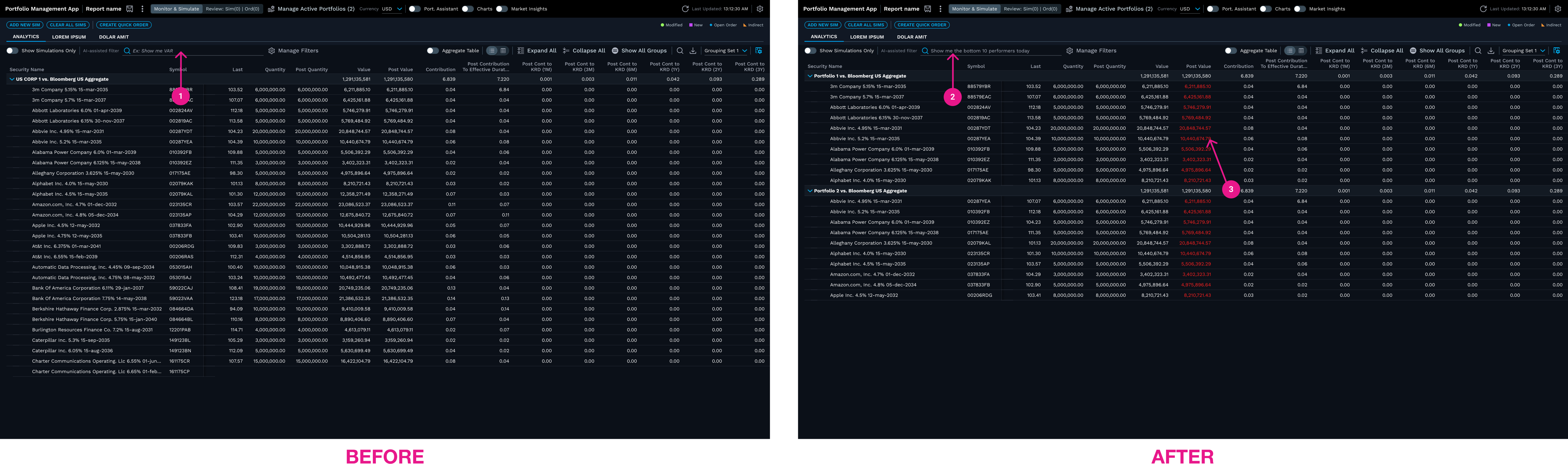
- 1.Before: the entry point sits empty on the current single-grid interface — the exposed textbox that shipped as the MVP, ahead of the tile roadmap.
- 2.After: a natural-language query is typed directly into the grid a user is already viewing — no separate panel or mode to switch into.
- 3.Matching values are highlighted in the grid, helping users scan results at a glance instead of manually parsing every row.
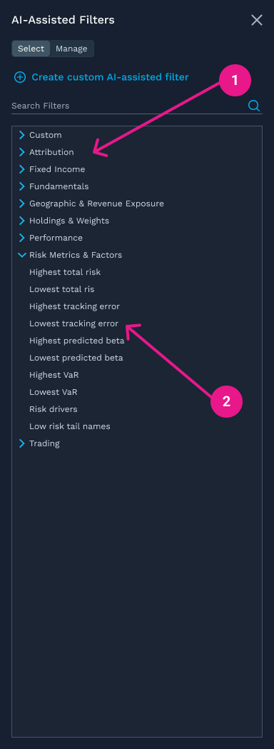
- 1.The PM organized candidate query phrasings into categories like Risk Metrics & Factors, validated with subject matter experts and sales.
- 2.Phrasings like these represent the kind of language the team believed users would realistically search for.
Decision
Why
Tradeoff
validation & feedback
Validation here was internal and stakeholder-driven, not user-tested — a direct consequence of the roadmap this project ran on. The strongest feedback loop was a regular practice, not a one-off.
Validation on this initiative was primarily internal and stakeholder-driven rather than user-tested — the multi-grid concept hadn't been built, and the AI-assisted filter was still in an internal-only pilot, when my time on the project ended.
The most consistent feedback loop came from live design jam sessions I regularly hosted with the Senior PM, Senior Engineering Lead, and Associate Director of Engineering. Working live in Figma Make or Claude Code, these sessions kept feedback immediate and honest: if a design was misaligned with a technical constraint or a stakeholder's expectations, we caught it in the room rather than after a full round of independent work. When the group wasn't aligned, these sessions were where we worked through it directly. This is part of why the dashboard → tiles → AI-assisted filter pivot sequence was able to move as quickly as it did — disagreements surfaced early rather than being discovered downstream.
Once the AI-assisted filter reached its internal pilot, informal reactions were positive. People were enthusiastic about the feature's potential — including its potential to be shown to clients — though this reflects internal excitement about the direction, not confirmed client or end-user feedback.
Pendo usage-data review, which had shaped earlier decisions (surfacing the multi-grid workaround pattern that led to Decision 2), was not revisited later in the process to validate the shipped AI-assisted filter or the broader concept direction. Formal end-user testing had not yet occurred for any of the three concepts by the time this work concluded on my end.
outcome
One piece shipped: the AI-assisted filter, as an internal-only pilot. The multi-grid and full-dashboard concepts remained unbuilt, documented as the next phases of a roadmap I no longer have visibility into.
The AI-assisted filter reached its internal-only pilot on the current single-grid interface by the end of my time on this initiative. Feedback from that pilot was informally positive, though no usage data or adoption metrics were captured during my involvement, so its actual impact on user behavior is unknown.
I left behind wireframes, layout explorations, and design specs for the multi-grid and full-dashboard directions, intended to give the team a starting point to continue the roadmap. What happened to that roadmap after my departure — whether the multi-grid phase moved forward, its timeline, or any further iteration — is not something I have visibility into.
reflection
The scope-back approach — start ambitious, then reverse-engineer down to what delivers value first — isn't something I'd treat as a universal playbook. It worked here because the team could engage honestly with which features were must-haves versus nice-to-haves. Not every team can; some resist scoping back because everything feels essential in the moment. Reading which kind of team you're in matters as much as the technique itself.
This reflection also clarified something for me: pulling the tile pattern in because my own direct reports were working on its source design system initiative is a concrete example of staying hands-on with design work creating leverage that pure management wouldn't have. It's part of the case I'd make for continuing to do both — individual design work and managing junior designers — rather than choosing one over the other.
I'd advocate for the live design jam sessions on any project, and I've encouraged my direct reports to build similarly close working relationships with their engineering counterparts. The format only works with the right people in the room, though — people who are knowledgeable, open-minded, and not easily rattled when ideas get challenged in real time. Get that right, and it measurably speeds a project up.
On validation: I normally push to test as early as possible, and chose not to here — deliberately, not as an oversight. It didn't seem worth the time to validate a full concept we already knew we couldn't deliver. I trusted the PM's judgment, as a strong UX research advocate, on where the real MVP boundary sat. In hindsight, a reasonable tradeoff given the roadmap constraints, but it's also why this case study's validation is internal and stakeholder-driven rather than user-tested.
More than any single decision, I'm proudest of the working relationship I built with this team — grounded in respect and empathy, the same qualities that made the jam sessions productive rather than chaotic, and what carried us through several difficult pivots without the process breaking down.